
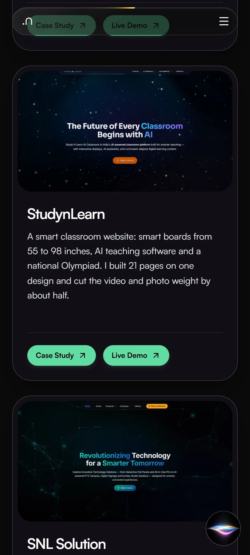
A smart classroom website: smart boards from 55 to 98 inches, AI teaching software and a national Olympiad. I built 21 pages on one design and cut the video and photo weight by about half.

Case study · SmartSchool Education
Frontend Developer · Jul – Oct 2026
A redesign of the SNL Solutions website. SNL sells smart classroom equipment to schools across India. Version 2 has 27 pages, scored 94–99 for phone speed when tested in September, and makes it easy to compare products.
Home page
SNL Solutions sells smart boards, all-in-one computers, classroom cameras and digital signs to schools across India. I redesigned its website. Version 1 was the previous site. Version 2 is my redesign, now live at snlsolution.com: 27 pages with one clean look, product pages where you pick a model and see its exact specs, studio setup pages, and pages that load fast on a phone.
Technologies, platforms, and tools used to design, develop, and deliver this project.





Schools compare sizes and specs before they call. The website has to make that easy, build trust, and lead to an inquiry.
Before planning, I went through the live site of the time, Version 1, on 27 September 2026, and checked its search basics on 3 October. Here is what I could see.
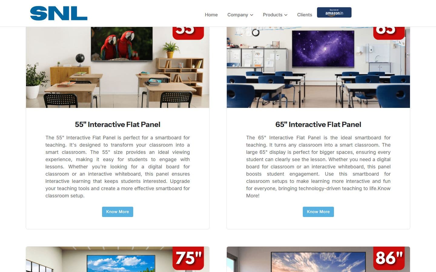
The flat panel has an overview page plus one page for each size. To compare 55 and 65 inches, a visitor opens two pages.
Products opens a list, and the flat panel and Studio Setup each open another list inside it. Reaching one studio takes three steps.
Most pages have clean addresses like /about-us, but a few still end in .php, such as /signage.php and /studio-setup.php.
Menu sections for schools, coaching and higher education are hidden in the page code instead of removed. Visitors never see them, but whoever edits the site next has to work around them.
Asking for a page that does not exist, such as /this-page-does-not-exist-xyz, returned a normal page with a success code instead of a 404. Search engines can index errors like that.
/sitemap.xml was a 404 and robots.txt had no sitemap line, so search engines had no list of the pages.
None of the seven key pages named its own address, and two different addresses (/snl-all-in-one-pc and /all_in_one) returned the same page.
/contact and /about-us showed the home page's title and description in search results.
I did not measure Version 1's speed or accessibility, so I quote no numbers for it. The search findings come from a check of the live site on 3 October 2026.
I ran no visitor interviews or usability tests, and I made no competitor study for SNL. What I had was the company's spec sheets, a page-by-page content check and, since 3 October, Search Console and Analytics data from Version 1, the live site.
Search Console lists 1,222 search phrases for the live site over the 90 days to 30 September 2026. Most of the visibility comes from blog articles, not product pages: eight of the ten pages with the most impressions are blog posts. The product pages that do rank are the all-in-one PC, the flat panel, the home page, the PTZ camera and digital signage.
Of the 96 phrases that were not brand searches and had 20 or more impressions, 89 appeared word for word on no rebuilt page, such as “all in one pc under 50000” and “camera for classroom recording”. Moving the redesign onto the live address without them would have risked rankings the old pages already earn, so each phrase now has an answer on the page it belongs to.
Analytics records no key events on any channel in those 90 days, so nobody can yet tell which visits led to an inquiry.
SNL's own sheets for the flat panel, the all-in-one PC, the camera and the digital sign became the source of truth. Every product answer is written from a sheet. If a sheet says nothing, the answer says so instead of guessing.
I compared the copied text with SNL's sheets. Some claims didn't match, such as the number of touch points and the Android version. I corrected the questions and answers from the sheet and marked the rest of that page's text for the owner.
Version 2 started from the design and pages of a sister brand. Some of its figures, testimonials and company history belong to that brand, not to SNL. I marked them for the owner to confirm instead of presenting them as SNL's.
The warranty period was written three different ways across the pages. I didn't pick one myself. I flagged it for the owner to decide.
Search Console and Analytics belong to snlsolution.com and were taken while it still served Version 1, so they say nothing about Version 2.
Version 2 has 27 pages on one design: 20 first, then the Studio Setup hub and its six studio pages. Click a name to open or close what sits under it.
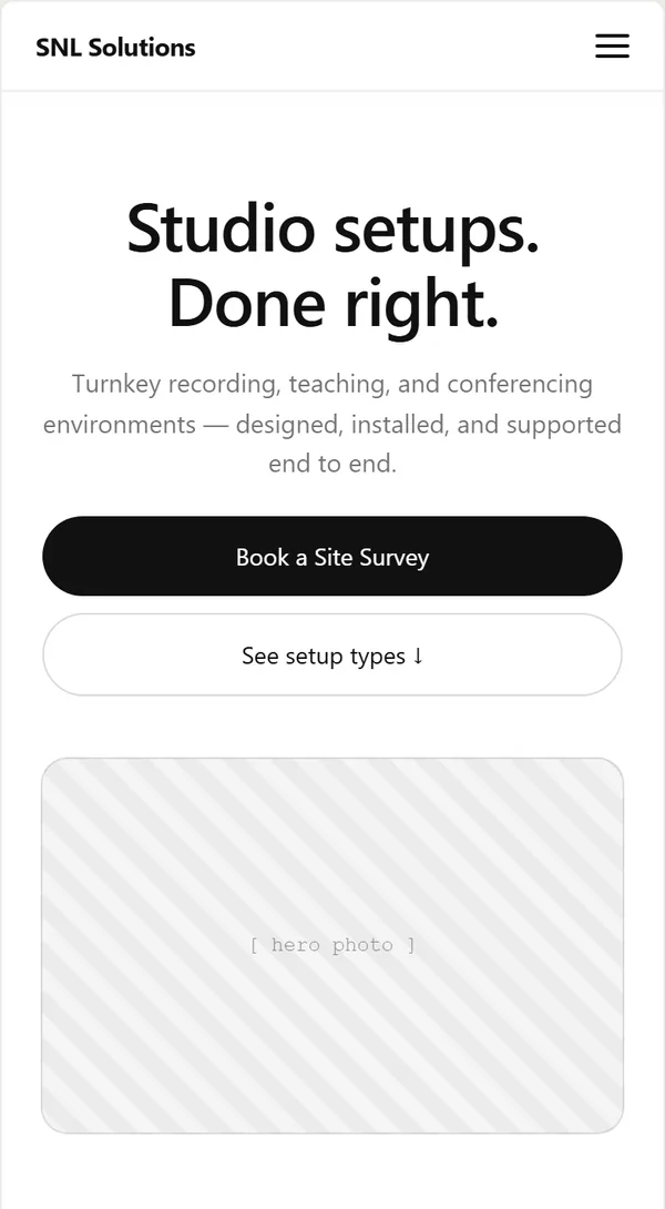
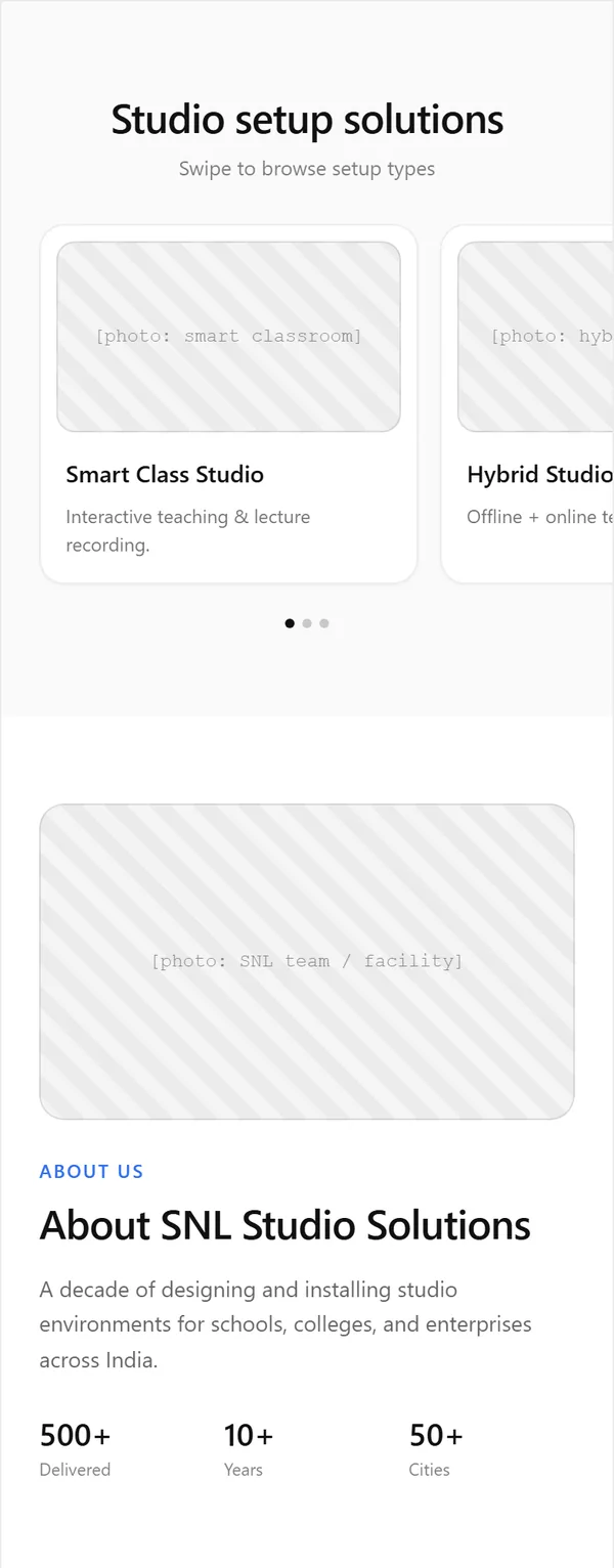
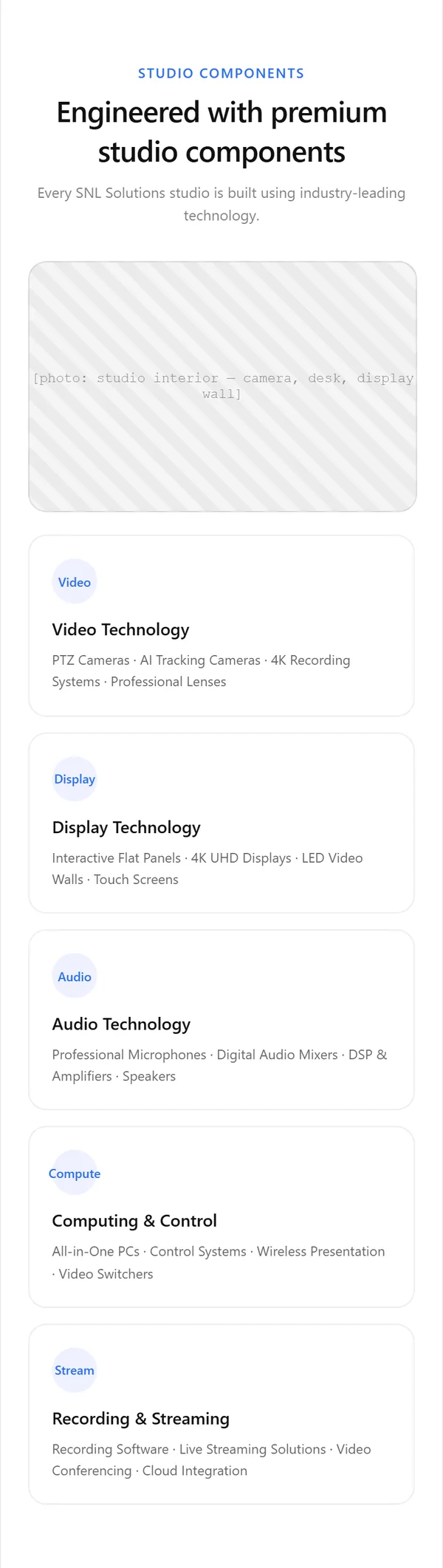
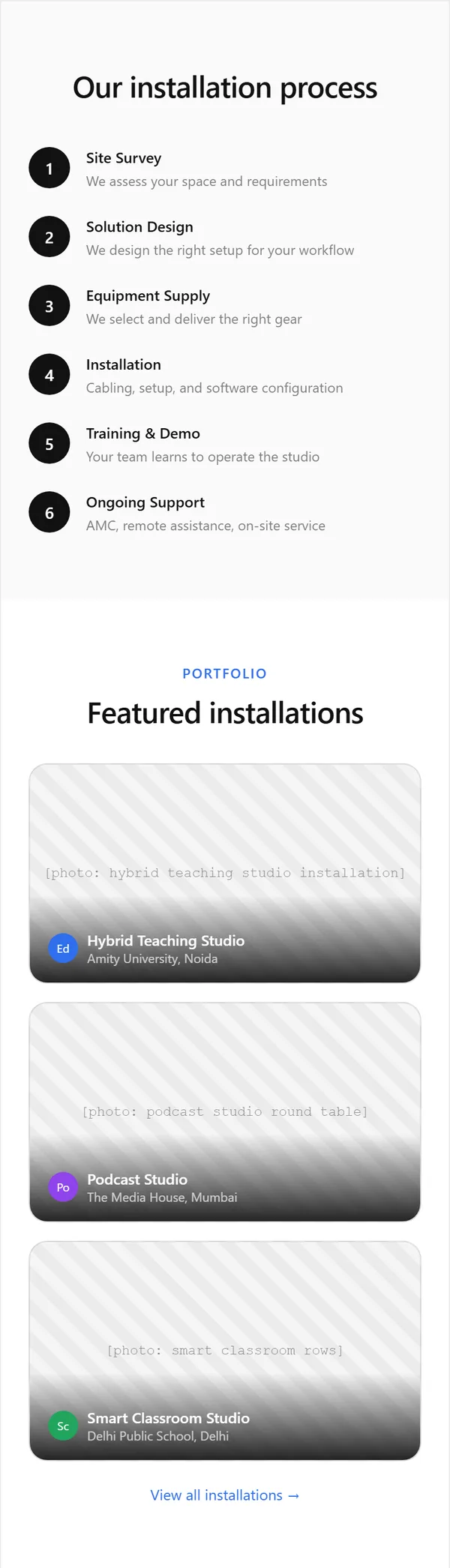
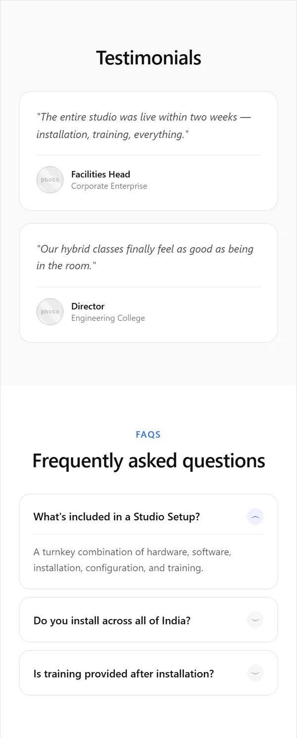
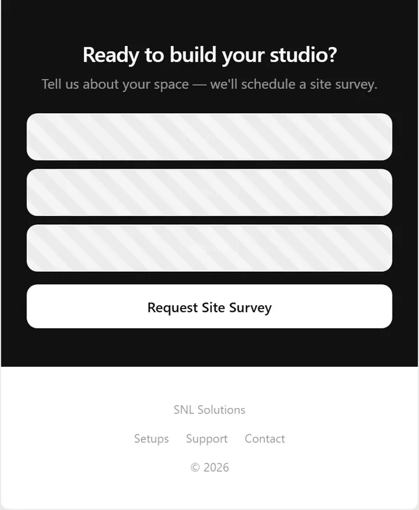
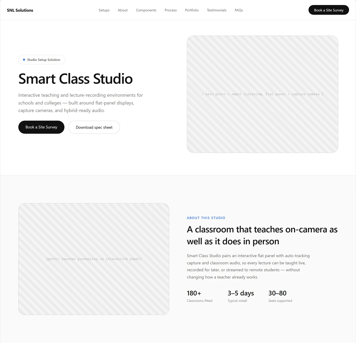
The first layouts were the Studio Setup landing page and a studio detail page, drawn as minimal wireframes: grey striped boxes stand for photos, and all names, numbers and quotes inside them are placeholder text. The home and product page wireframes are still to come.
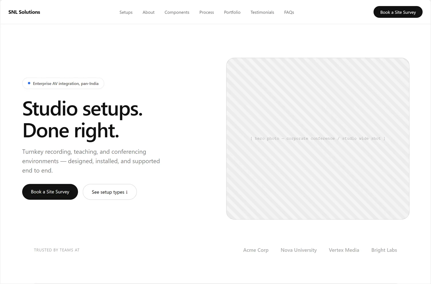
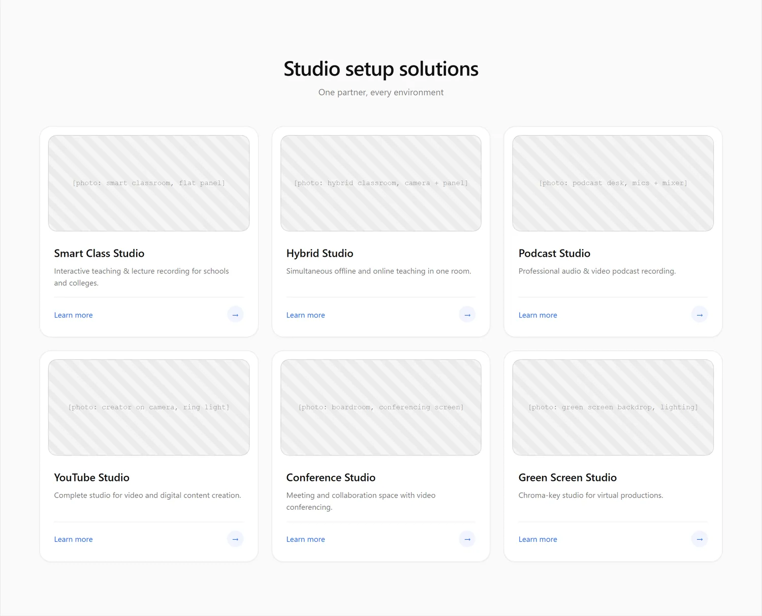
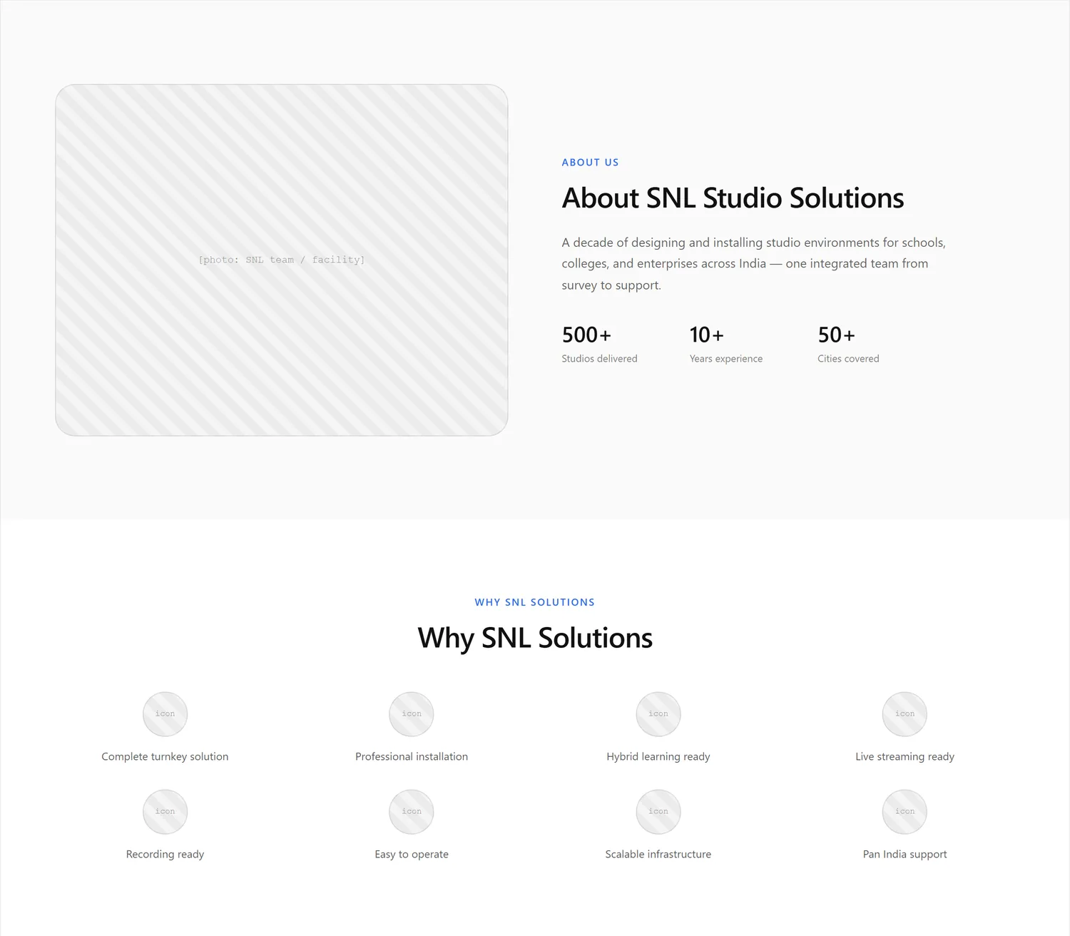
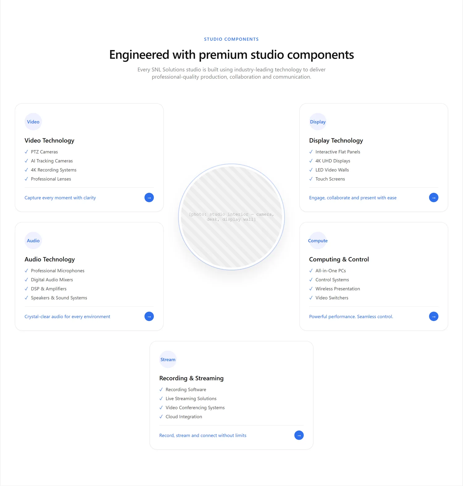
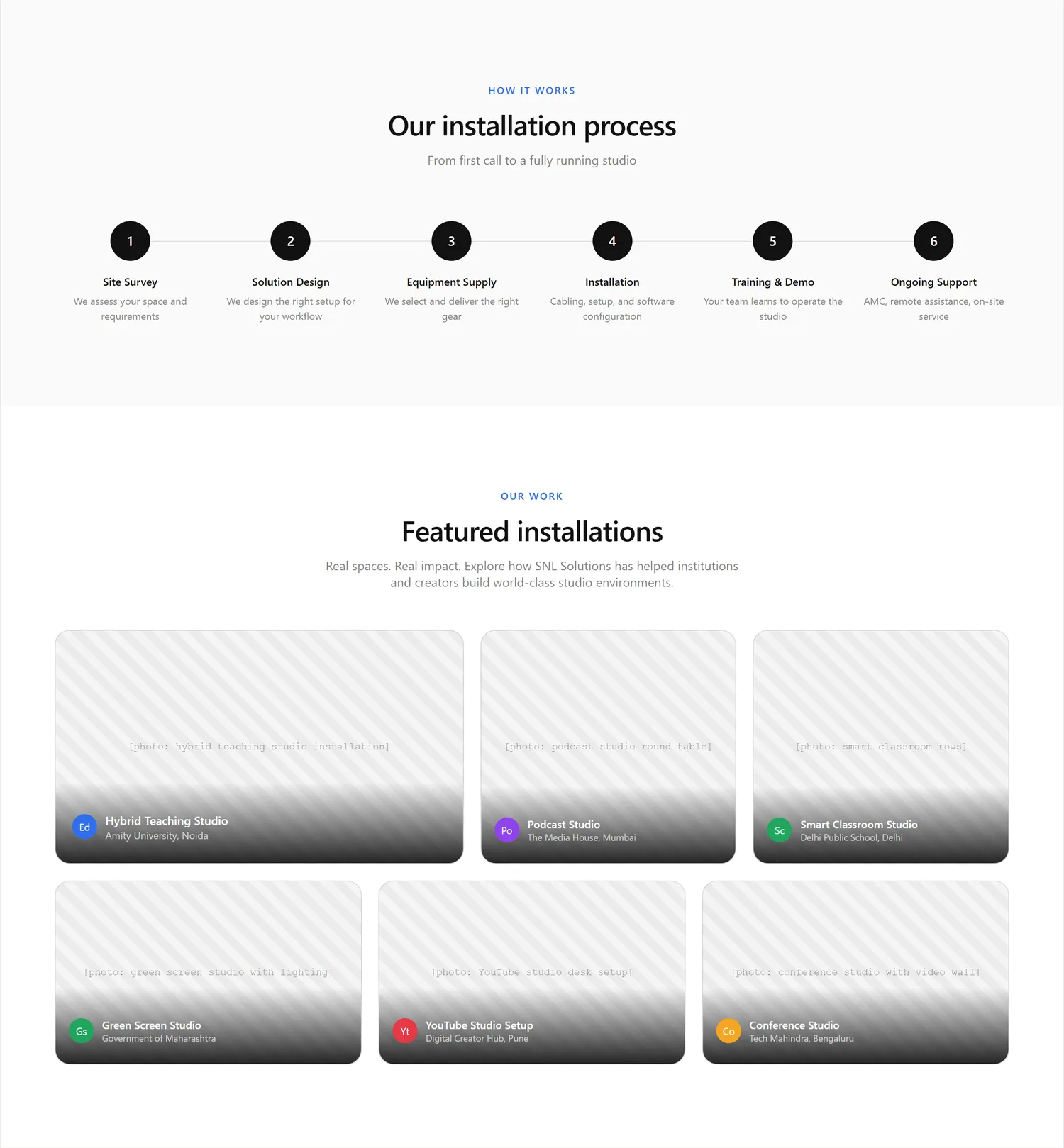
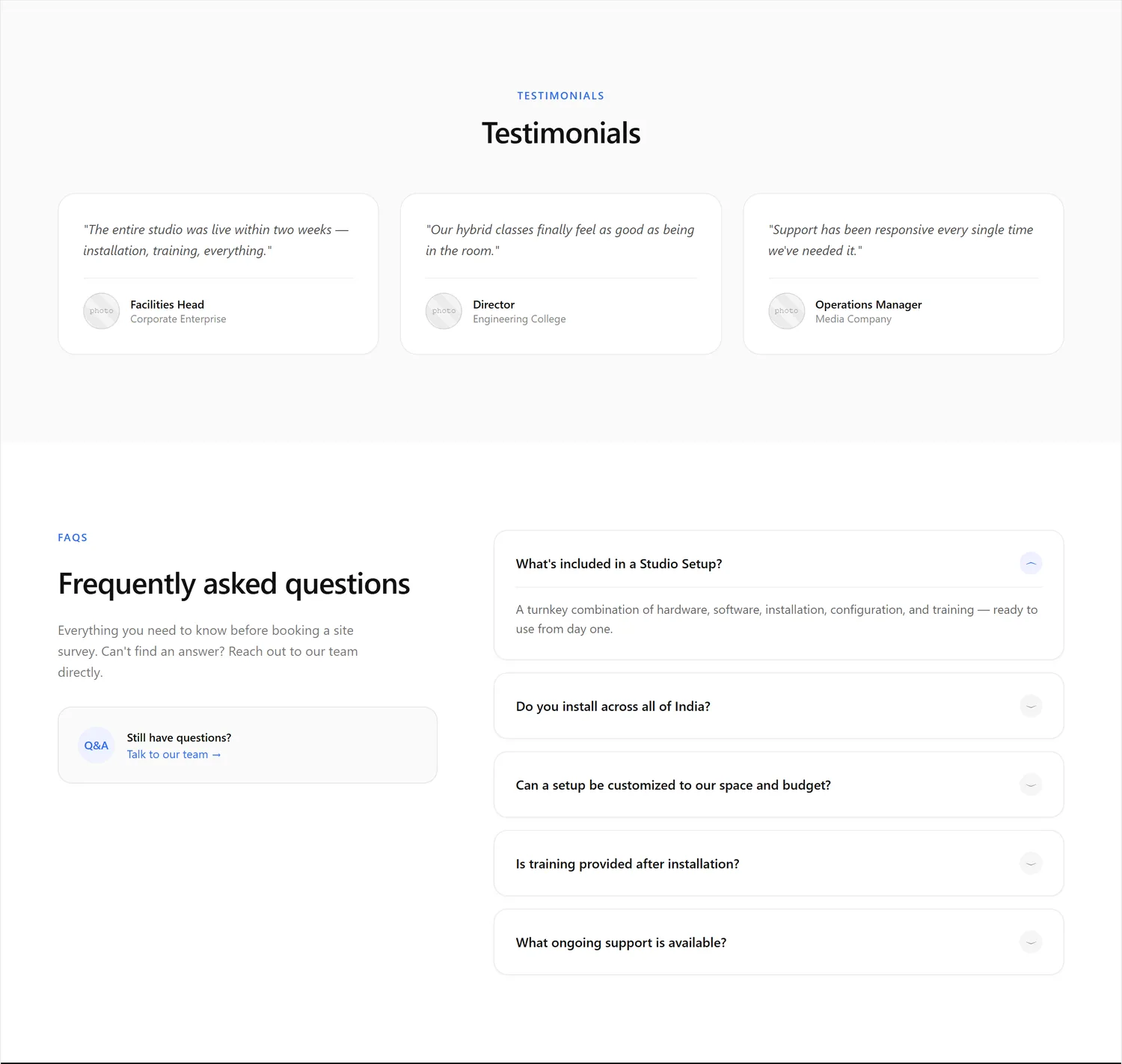
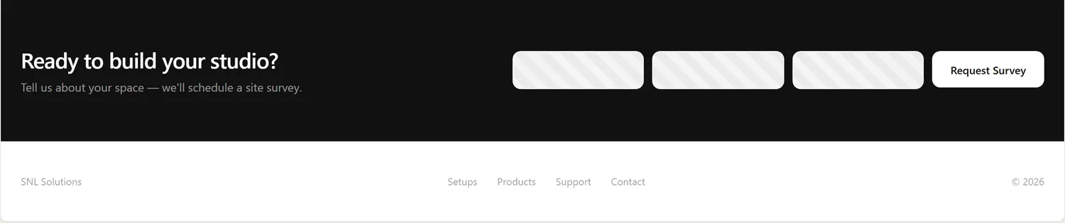
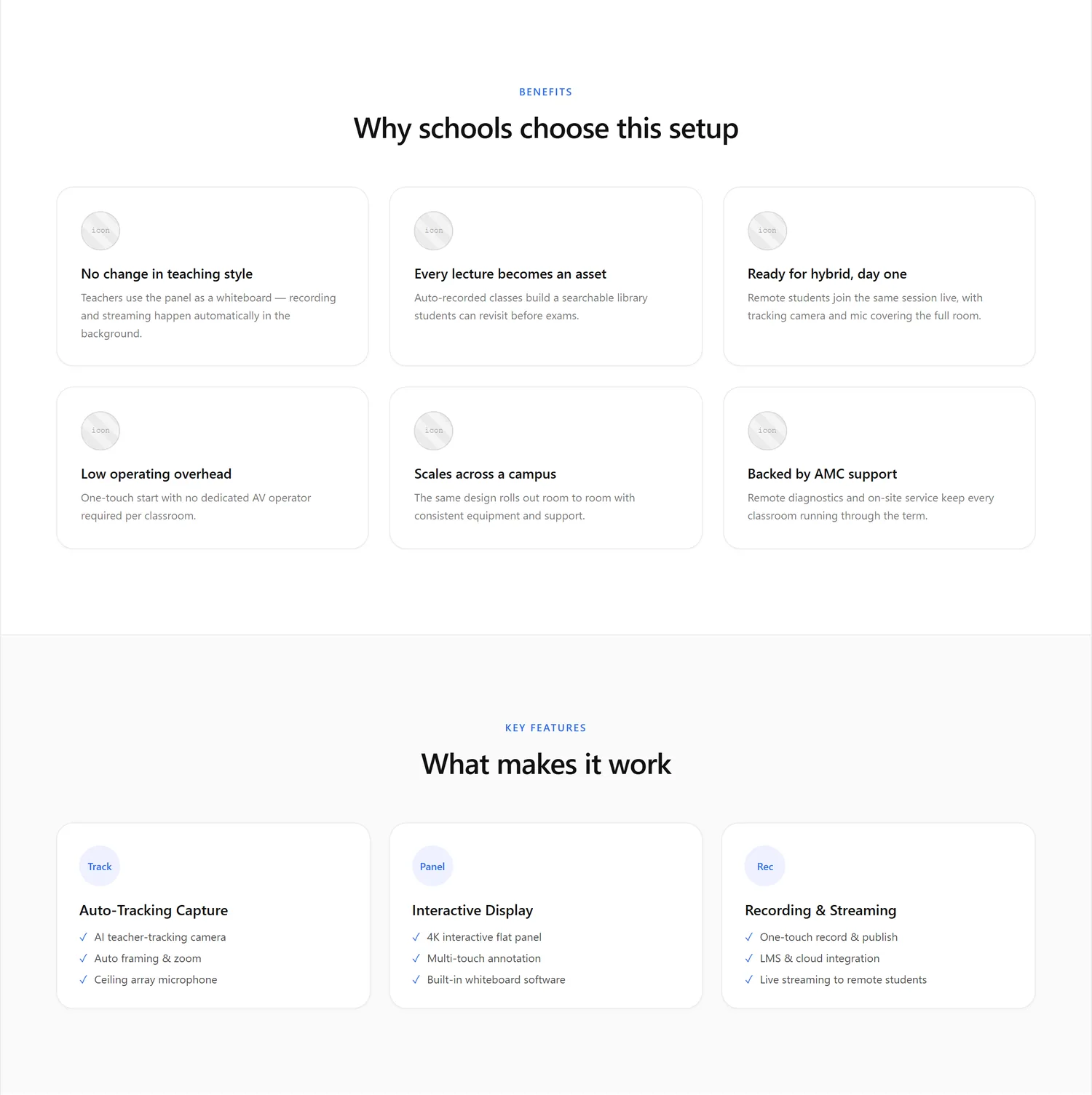
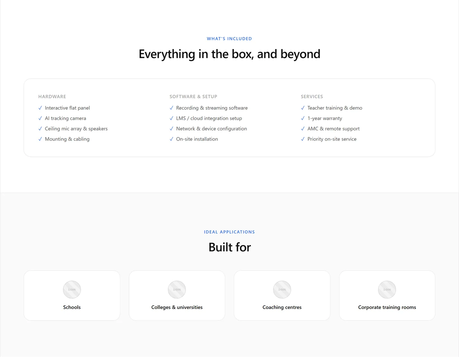
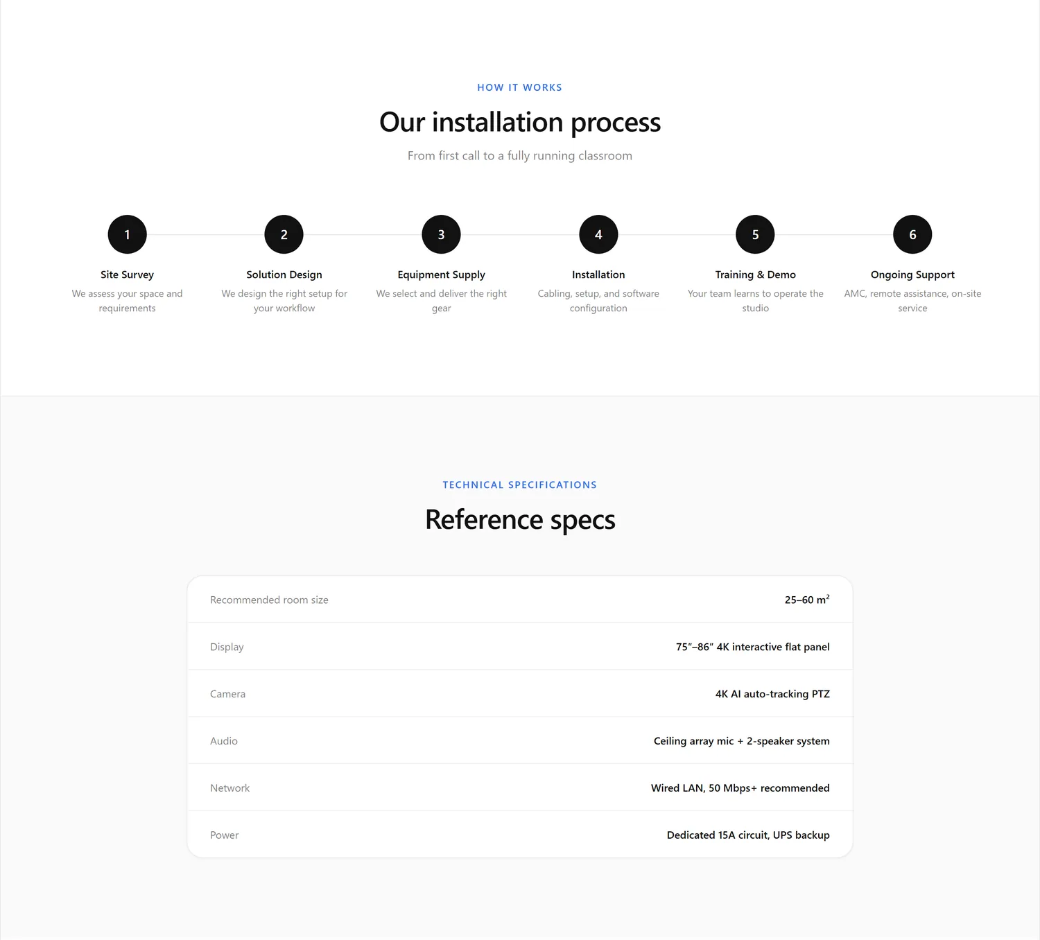
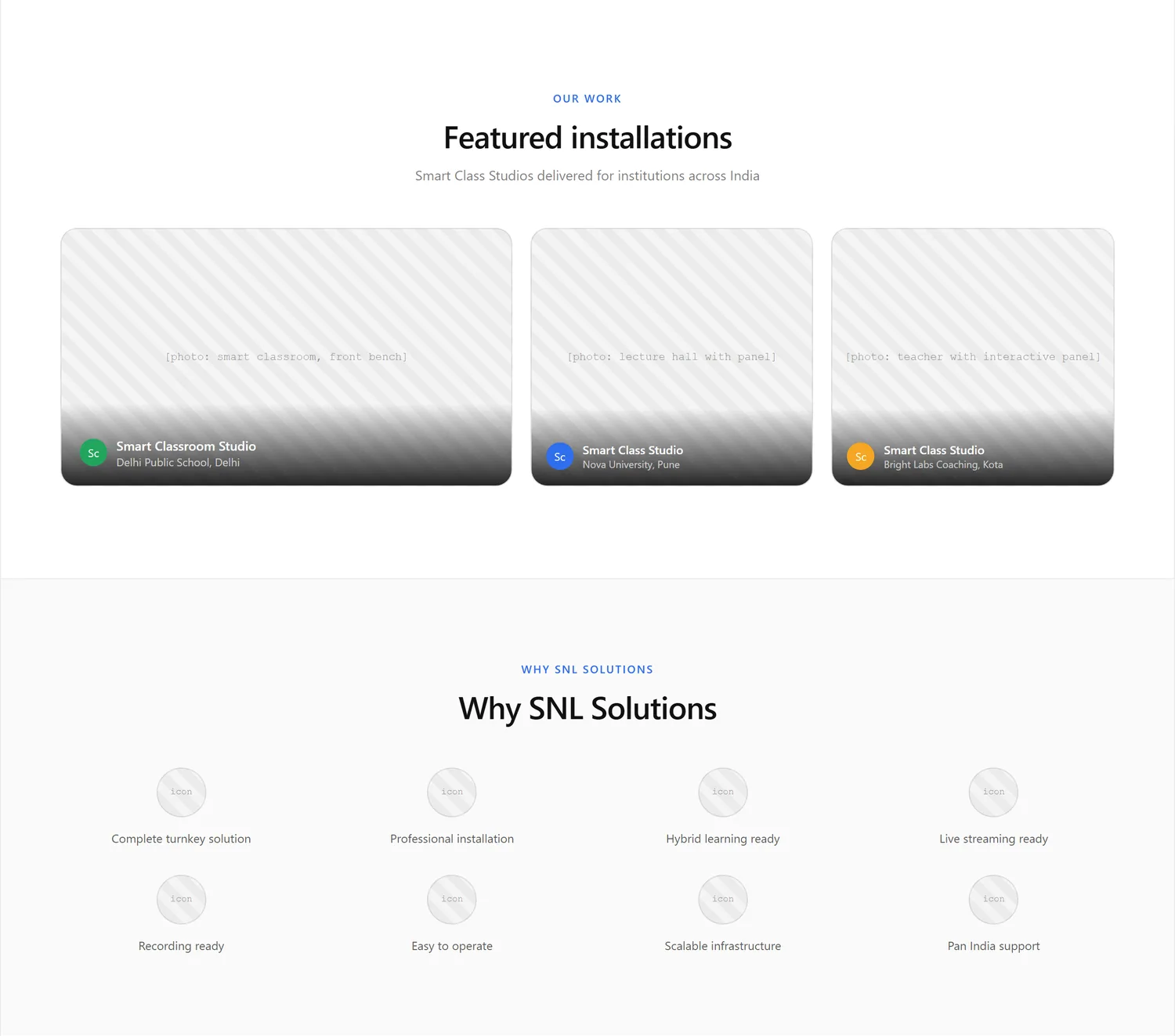
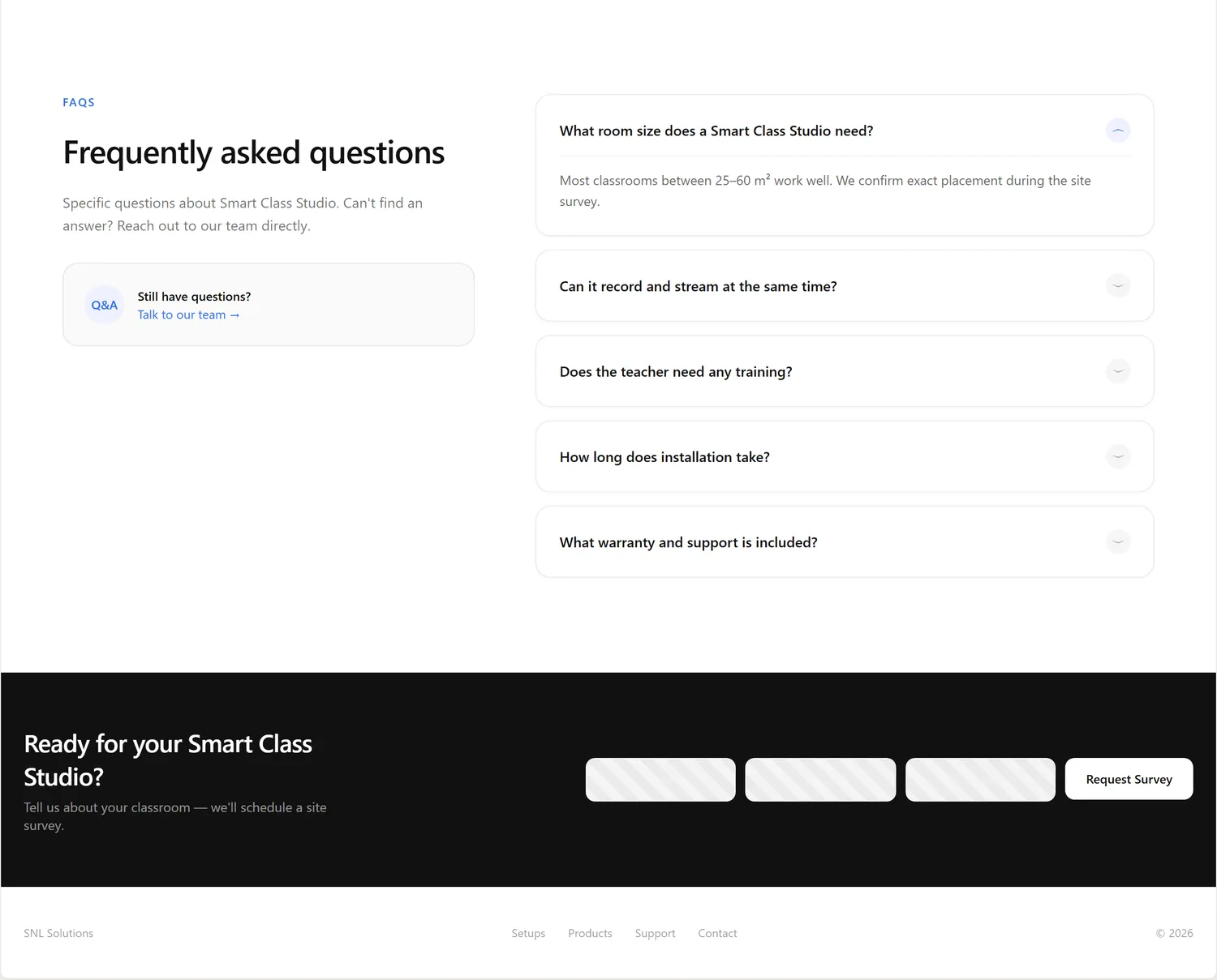
Home page wireframe
Coming soon
Product page wireframe
Coming soon
Home page
Coming soon
Product page
Coming soon
The header and the top section both say “Book a Site Survey”, as a filled button, with an outlined “See setup types” for the second choice.
The six studio types sit in a three-by-two grid. Each card has a photo, a name, one line and a “Learn more” link to its own page. On a phone the cards become a swipe row.
A studio page runs from what it is, to the benefits and key features, to what is included, where it is used, how installation works and the technical specs, then past work, why SNL, questions and one closing call to action.
The built studio pages reorder a little and leave out the specs table, the featured-installations gallery and the “why SNL” block. An equipment list takes the place of “what is included”, and a row of the other five studios closes the page.
Version 2 began as the design system of SNL's sister brand, Study'n'Learn, copied in on 24 September and adapted for SNL. On 3 October the owner moved it onto light page backgrounds and a mint-to-blue gradient taken from a reference image, with no orange except one button.
One family for headings, body text and forms, so the hierarchy comes from size and weight alone. The main headline scales from 40 to 64 px, section titles from 32 to 48 px, card titles from 18 to 22 px, and body text is 16 px with 14 px for small text.
The font is a 32 KB file served from the site, plus a 1 KB file for the Ω sign the spec tables use, so no page asks another website for type. Sora, the earlier heading font, was dropped on 3 October.
Mint to blue
Every filled button, the active tab and badges.
Mint
#00f3b5
Text and lines on dark sections.
Teal
#0aa8c7
The middle of the gradient, and rings and glows where a gradient can't go.
Royal blue
#1354db
Links, text and borders on light sections (6.3 to 1 against white).
Ink
#0a0f1e
Headings and strong text.
Night
#060a12
The dark top section and dark bands.
Cool grey
#f8fafc
Alternate bands and form fields on light pages.
Amazon orange
#ffa41c
Only the Buy on Amazon button, in Amazon's own colors, at the owner's request.
A stylesheet never writes a color for a surface, a text step or a border. It reads a named role, so the whole site can change look in one block of code.
Every page uses the same header, footer and top section, so a visitor never wonders if they left the site.
No product claim goes on a page without a spec sheet behind it.
Buttons and tabs are at least 44 px on touch screens, and text boxes use 16 px text so phones don't zoom in.
Things only fade and slide, in three set speeds (0.15, 0.3 and 0.6 seconds), and all of it switches off for visitors who choose reduced motion.
Pages read on white. Dark bands, such as the top section and the support block, add weight, and each one is listed in a single place so it takes the right colors.
What I changed from the sister brand: the SNL wordmark, the mint-to-blue gradient in place of its cyan-to-violet, light page backgrounds, one shared top section for every page, a small motion layer, and the Buy on Amazon button.
Real screens from Version 2, taken on 6 October 2026 on a laptop-size screen (1440 px wide) and a phone (390 px wide), in four groups.

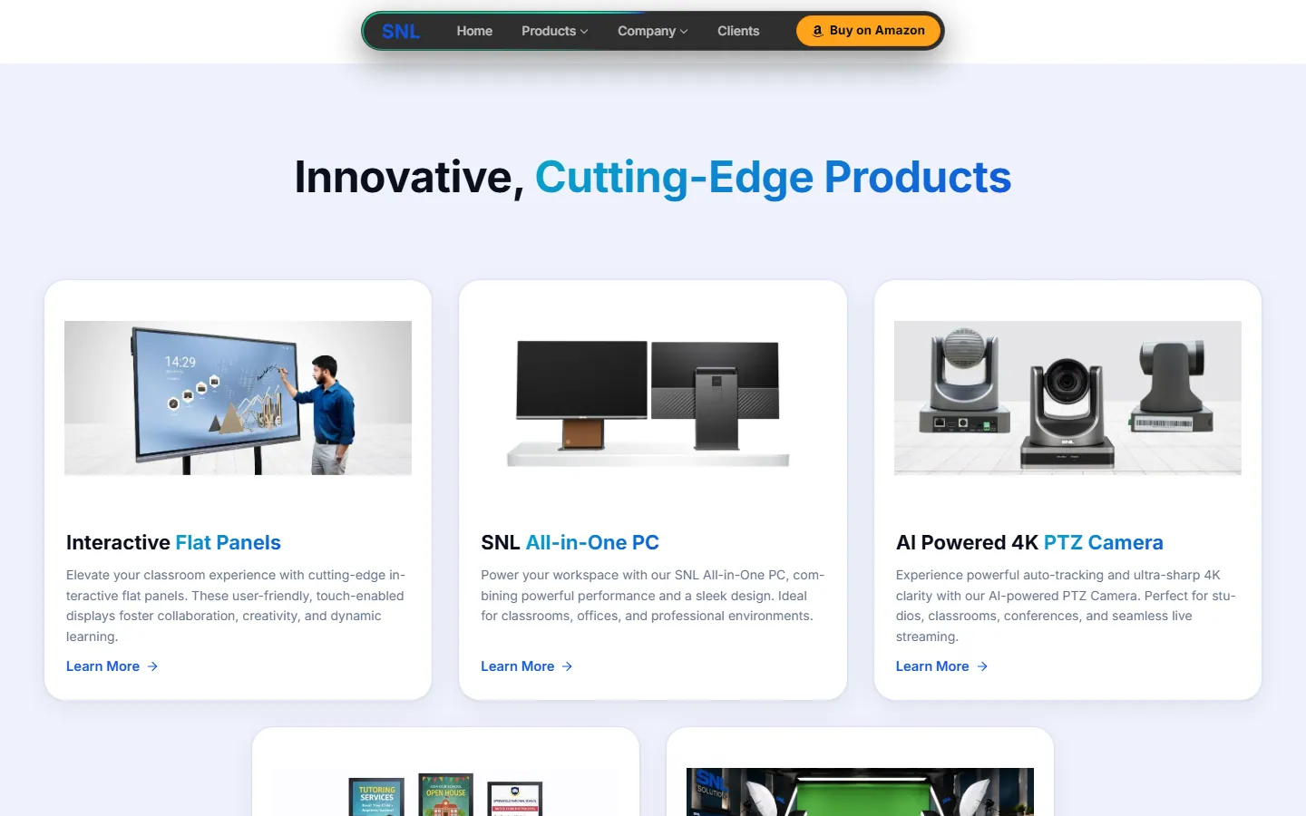
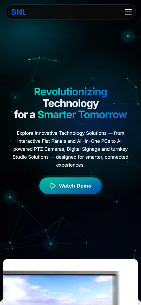
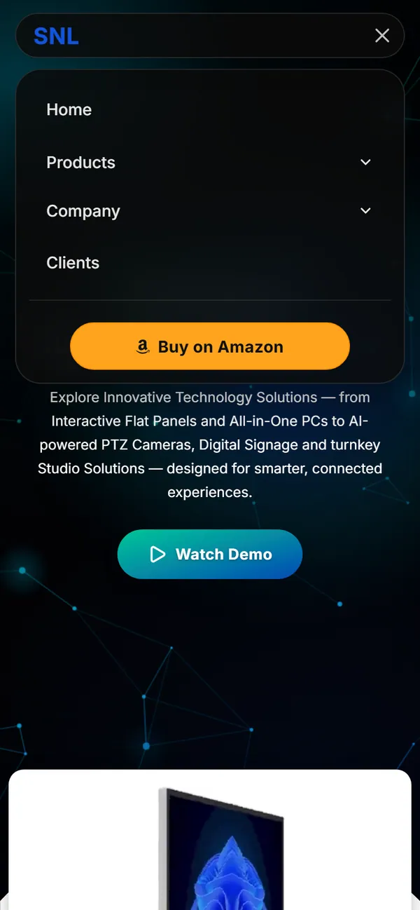
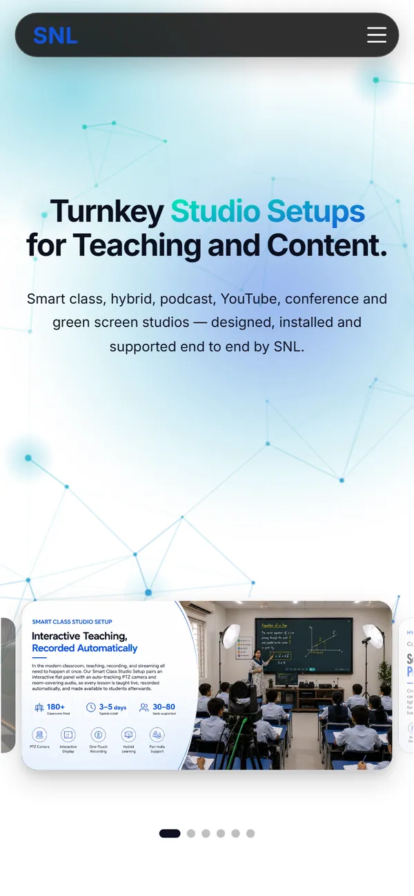

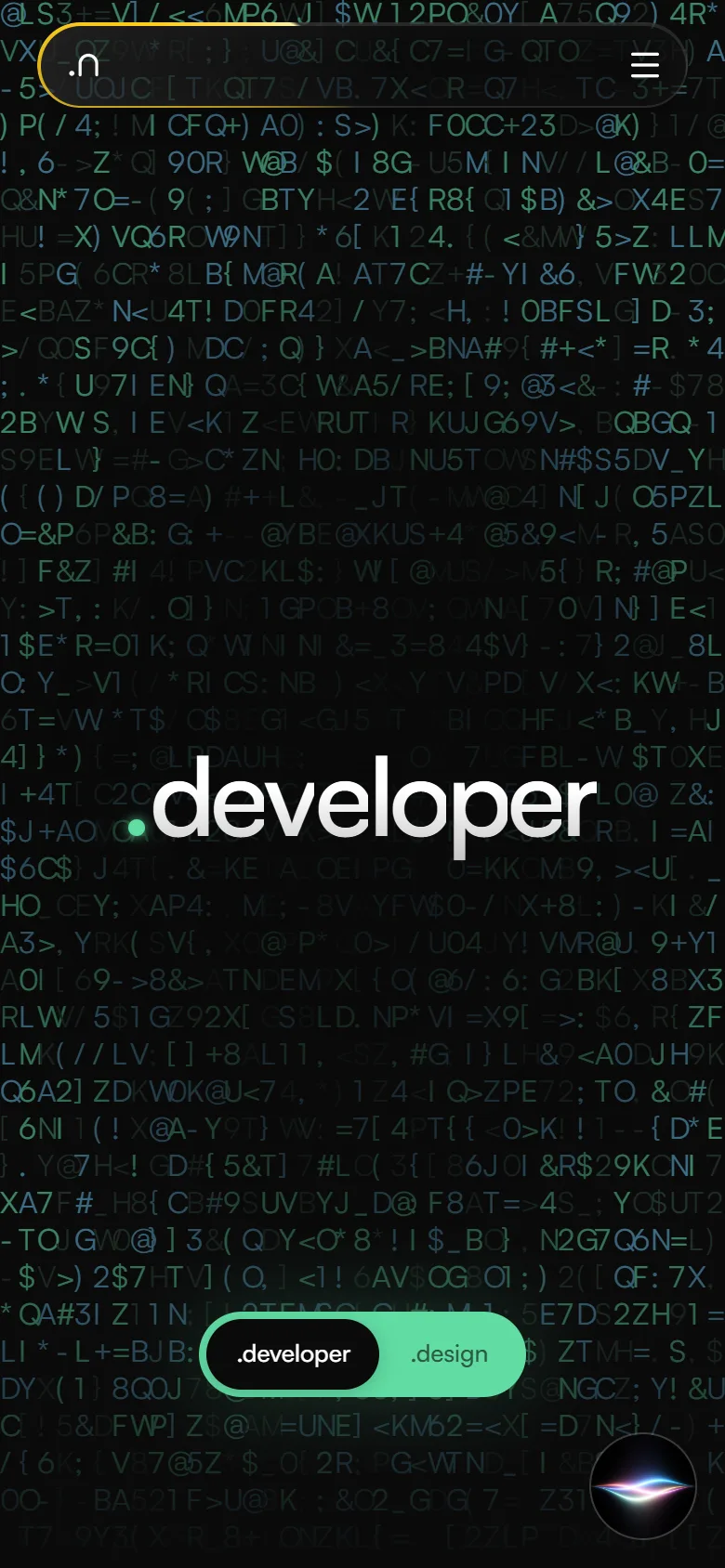
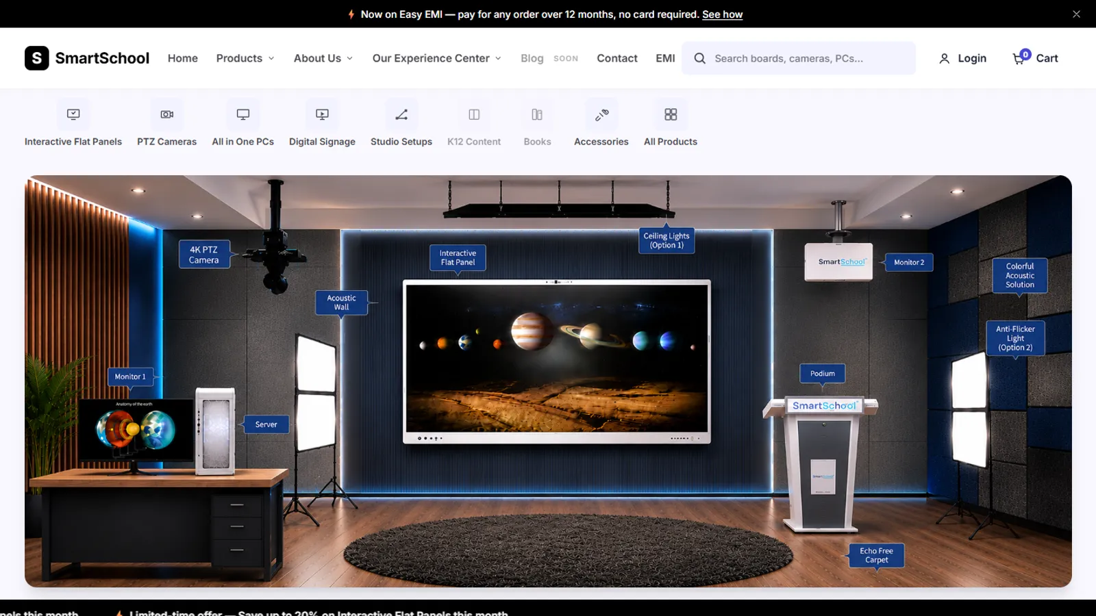
A rounded dark bar that shrinks slightly as you scroll, with Buy on Amazon in Amazon's own colors at its end. On a phone it becomes a drawer.
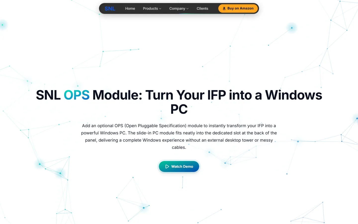
A big headline with gradient words and one main button, dark with a slow dot-and-line background on most pages and white on Studio Setup, OPS and the company pages.
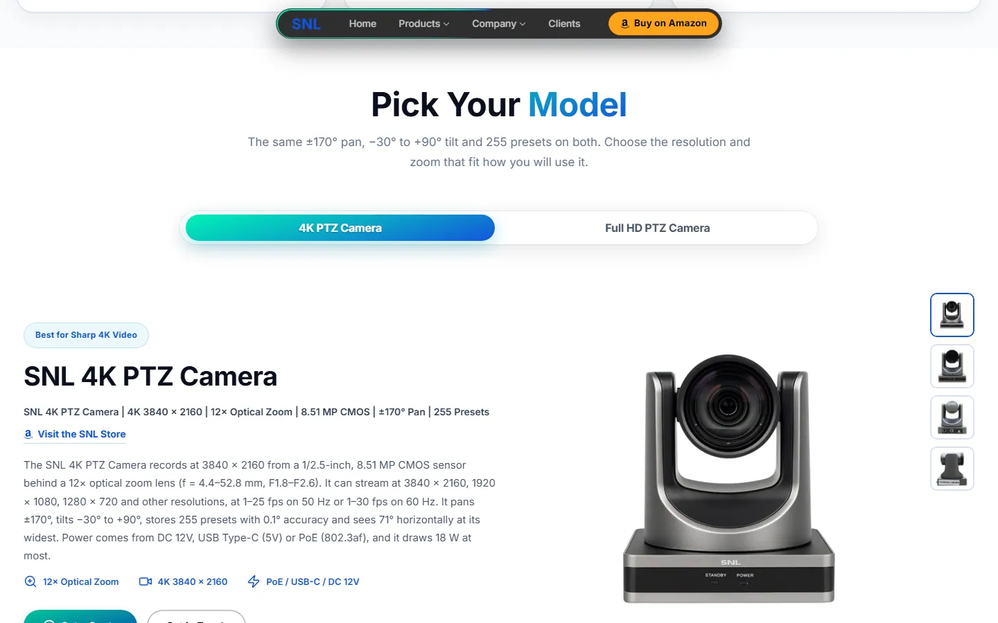
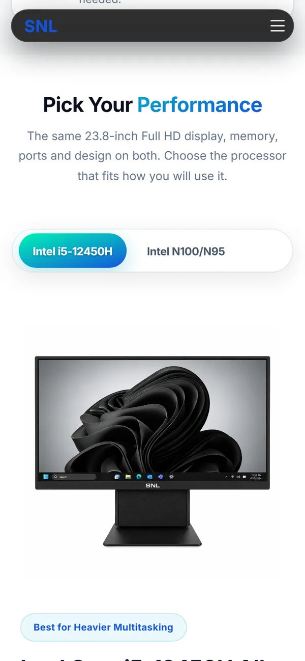
Tabs with a gradient active pill. Each model shows its own text, badges and photos, with a zoom on hover.
Groups of exact specs that open and close. A blank cell on the sheet shows a dash with the note “Not listed on the specification sheet”.
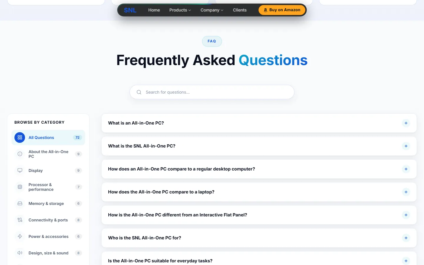
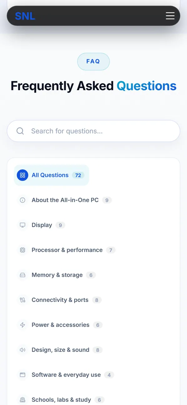
Searchable, with category tabs and a count on each.
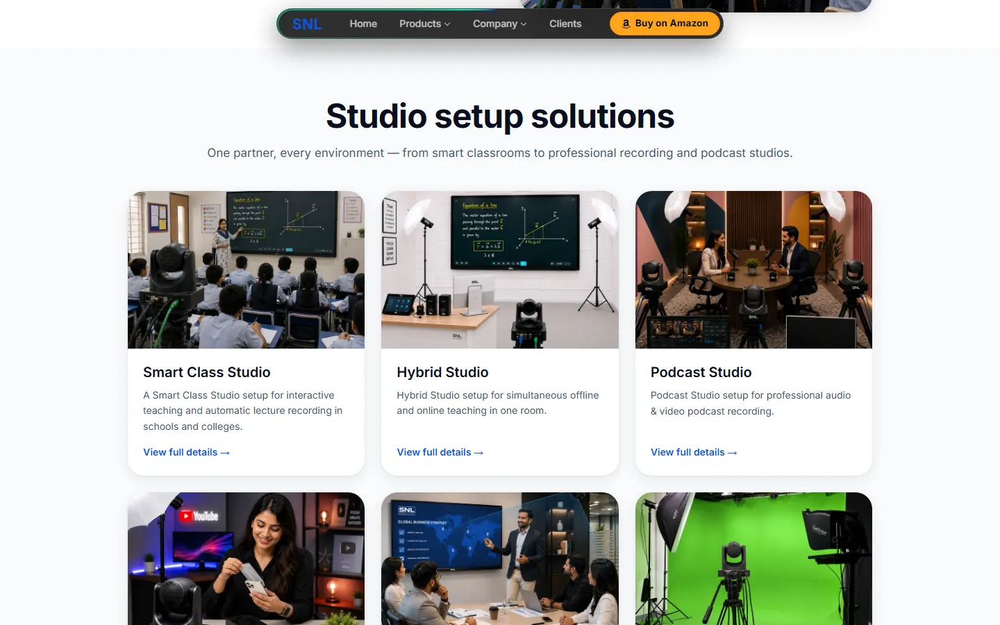
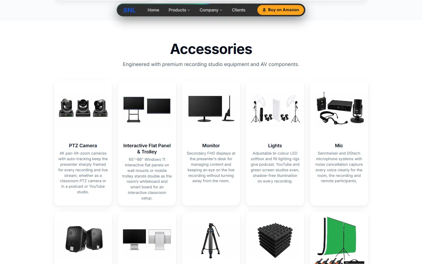
A photo card for each studio type, an accessories grid, and an installation process that stays pinned while you move through its steps.
“Ready to Experience the Future of Technology?” with a Book a demo button, above every footer.
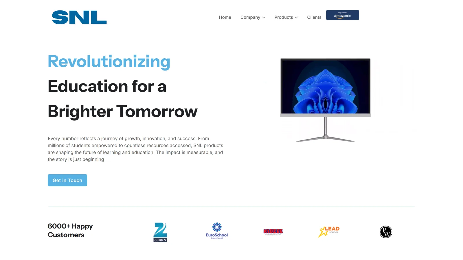
Version 1 screenshots were taken on 27 September 2026 from the company's live site, before Version 2 replaced it. Version 2 screenshots were taken on 6 October 2026 from my latest build.
Version 1
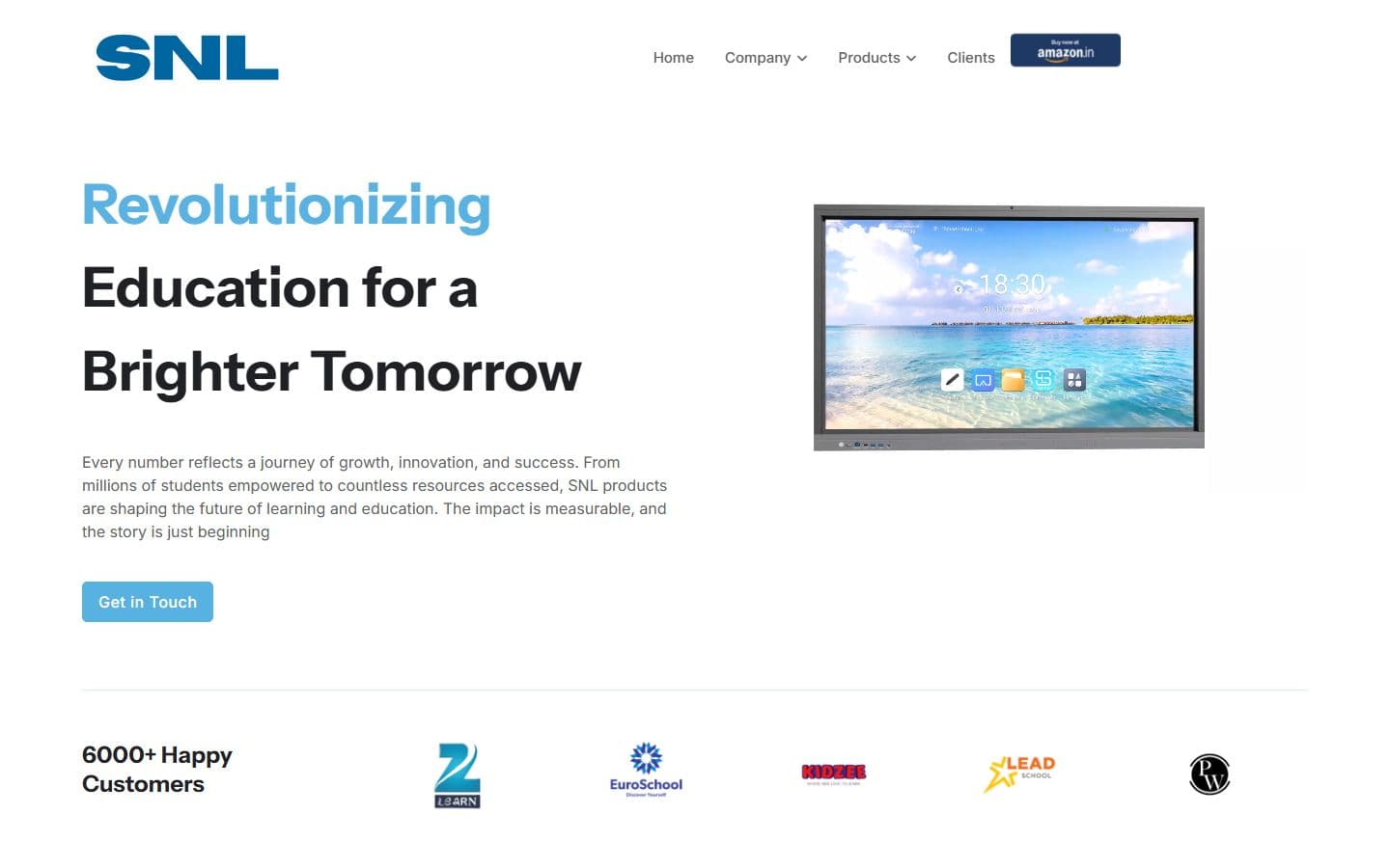
Version 2
Version 1 is a light page with the menu across the top. Version 2 is a dark page with the menu in a floating bar, gradient words and one clear button.
Version 1
Version 2
Version 1
Version 2
Version 1
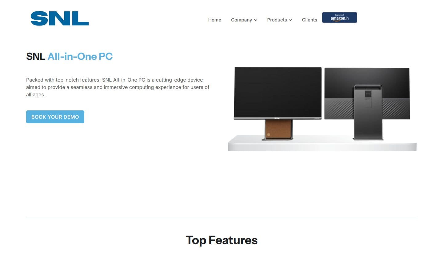
Version 2
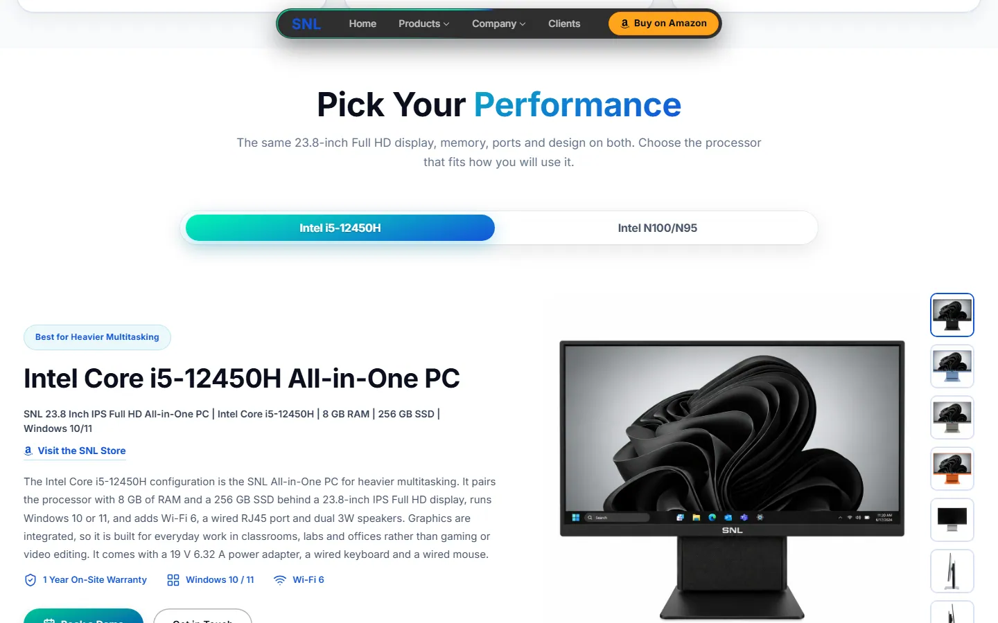
Version 1 opens with a general description and a button. Version 2 lets you pick the processor and shows the exact model line, warranty and Wi-Fi badges, with the full spec list below.
Version 1

Version 2
Version 1
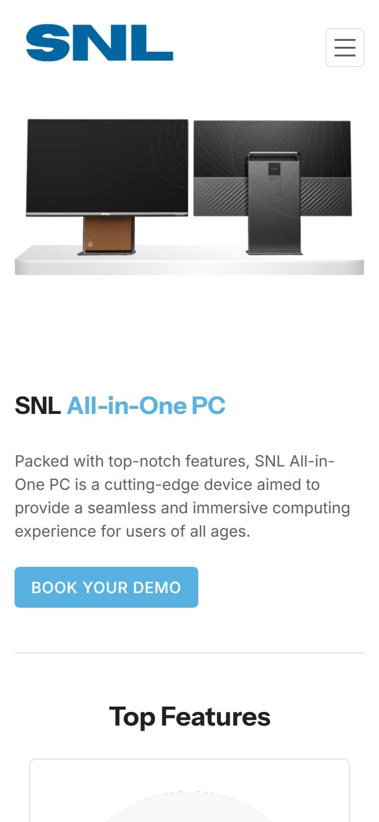
Version 2
The brief became three technical rules: no framework, because the company's own code is PHP; every product claim traceable to a spec sheet; and nothing assumed about the live server.
Plain PHP, hand-written CSS and vanilla JavaScript. There is no framework and no build step, because the company's own code is PHP.
The pages started from the sister brand's design system and page structure, rebranded for SNL. Anything that could not be checked for SNL, such as figures, history, testimonials and legal text, is flagged in the page notes instead of being published silently.
Version 2 deploys from git to a preview site. The company's own server changes only through a package its developer applies, so before writing anything for that server I ask for his current files. Version 2 is now the live site at snlsolution.com.
Version 2 uses the company's own kind of code, so it can be handed over and dropped in.
27
Pages
1,479
Questions answered
106
Icons, stored on the site
1
Server functions on Vercel
Every page is one PHP file that pulls in the same header and footer, plus one top-section function that takes a title, text and buttons. A page's own styles load only on that page.
There is no CMS or database. Each page keeps its questions in one list in the code, and that one list draws both the visible answers and the data search engines read, so the two can't disagree.
The pages sit in the project root. Shared PHP and the structured data for each page live in one folder, and the styles, scripts, images, videos, fonts and vendored libraries in another. Pages and files taken out of use go to an archive folder that is never deployed.
One set of screen widths, 360, 480, 768, 1024 and 1280 px, designed from the phone up. The menu turns into a drawer on small screens, and full-height sections use the visible screen height so phone address bars don't cut them off.
Fade-and-slide reveals, hover lifts and menu transitions. It moves only opacity and position, watches one marker instead of listening to scrolling, and switches off for reduced motion. The dot-and-line top background loads only on wider screens, once the browser is idle.
Flat panel sizes, all-in-one processors, camera models and sign sizes each have a picker. A blank cell on a spec sheet shows a dash instead of an invented value.
Every page with questions has at least 60, such as 72 on the all-in-one PC page and 68 on the PTZ camera page, with category tabs and a search box. Where a sheet says nothing, the answer says so.
A hub and six studio pages (smart class, hybrid, podcast, YouTube, conference and green screen), each with its own equipment list, installation steps and questions.
The SNL OPS page explains the optional Windows module that slides into a flat panel, with a ports table that fits a phone.
Flyout menus flip sides so they never leave the screen. On a phone, Escape closes the drawer and puts focus back on the menu button.
Three short looping videos (GeM, Make in India and CMMI Level 5) that load only when the footer is near.
A footer pop-up with a payment link and a QR code.
A certificates page and a downloads page with filter tabs. Photo galleries open in a lightbox that loads only when needed.
Version 2 has no database or CMS of its own. It reads the company's feeds and hands the rest to other services, and none of these connections can leave a page empty.
The Blogs and Newsroom pages load from the company's blog and news feeds, cached for an hour, with a saved copy as backup. Visitors see the company's own posts and stories with a category filter, even if a feed is slow.
The Get in Touch form opens a ready-written WhatsApp message.
Product pages link out to SNL's store on Amazon.in through one shared setting and one helper, so changing the store address is a one-line edit.
The Google Maps embeds are the only outside requests left on the site, and they load only when someone taps.
Speed work measured with Lighthouse on a phone setup, and a way to prove that a change did not alter what a page looks like or does. The measured results are under Results.
I drive the site in a headless browser from a script. For a visual change I compare measured styles and positions with a frozen copy of the previous commit. For behavior I use real key presses and check what is under the pointer. Screenshots are for looking at, and numbers are for checking.
Lighthouse scores and timings moved a lot between identical runs on a busy machine, so I trusted page size, request count and outside connections, which do not wobble. A move of less than about 5 points or 300 ms I treated as noise.
Problem
My first speed test found the smart board page was 7.2 MB, mostly one video, and every page loaded fonts and icons from other websites.
Solution
I shrank videos and photos for phones, hosted fonts and icons on the site, and made maps load only when tapped.
Result
The smart board page went from 7,151 KB to 672 KB, and the home page from 2,290 KB to 480 KB.
Problem
I split a large script to help phones load faster, but that could change how the animation looks.
Solution
I built a test that replays the animation frame by frame and compares it with the old one.
Result
57 of 66 checks matched exactly. The other 9 were changes I meant to make.
Problem
The copied stylesheet carried rules that no page used.
Solution
I removed 1,392 unused style rules, then checked that nothing changed on screen.
Result
A lighter stylesheet with no visible change.
Problem
On phones, the “Why choose” cards were squeezed into two columns about 85 px wide, and a comparison table ran off the screen with its last column out of sight.
Solution
A one-column rule for phones existed, but a later four-column rule overrode it. I fixed the order of the rules and fitted the tables to the phone width.
Result
Both now fit a phone with nothing to scroll sideways.
The Lighthouse figures here are from 26 September 2026. I have not measured again since, so they describe that day.
Rankings happen on the company's own domain, snlsolution.com, which I can't deploy to, so my work reaches search engines only as a package its developer applies. I made every page easy for search engines and AI tools to read, and checked it with a crawl of the running build on 6 October 2026.
27
Pages checked
18
Open to search engines
9
Held back on purpose
1,479
Questions answered on 24 pages
Each page has its own title of about 50 to 60 characters, a description of about 140 to 160, a share preview and one main heading. None of the 27 pages shares a title with another.
A single helper builds what every page tells search engines: the company, the website, the page itself (typed as About, Contact or a collection where it fits), a breadcrumb trail and the question list. I added no product or review markup, because there is no first-party price or review data to back it and Search Console would flag it as errors.
Every page that has questions has at least 60: 72 on the all-in-one PC page, 68 each on the PTZ camera and digital signage pages and 67 on the flat panel page. Google retired the special search result for question lists on 7 May 2026, so the markup earns no extra feature. The value is the words on the page, which now include the phrases that were missing.
robots.txt names the main AI search crawlers, such as ChatGPT, Claude and Perplexity, and welcomes them. The sitemap and robots.txt are built from one page list, so they never hard-code a domain, and a plain llms.txt file says in words what the company sells.
A small script crawls the running site and compares every page's title, description, canonical address, robots rule, main heading, data types and question count with a saved snapshot. It flags a change that would hurt search, so a copy edit can't quietly break a page.
The seven Studio Setup pages stay out of search until the owner replaces five placeholder testimonials with real quotes, and the Development Center page is held back by the owner's decision. The Experience Center is a coming-soon page.
Brand searches already bring people in, so every title keeps the SNL name. Each page then aims at one main group of phrases, taken from the Search Console data, so pages don't compete with each other.
Interactive flat panel
smart board, interactive flat panel, IFP price, best interactive panel in India
All-in-one PC
all in one pc for schools, all in one pc under 50000, computer lab
PTZ camera
camera for classroom recording, PTZ camera India
Digital signage
school digital signage, digital notice board
SNL OPS
OPS module, slot-in PC
Studio Setup and six studios
studio setup, podcast studio, YouTube studio, green screen studio (held back from search for now)
The 3 October check of the live site found problems that only the company's own server can fix, so each fix here is a file its developer has to apply.
Found
Any address, even one that does not exist, answered “OK” with a normal page.
Fix
Version 2 sends a real 404 for an address that does not exist, such as a studio that isn't there.
Result
Done in the build. The live server still needs the same rule.
Found
No sitemap, and robots.txt had no sitemap line.
Fix
Both files are built from one page list, with the production addresses.
Result
Ready. The company's developer deploys them and submits the sitemap in Search Console.
Found
No canonical addresses, and two addresses served the same all-in-one page.
Fix
Every page names one canonical address, the one it would have on snlsolution.com. The all-in-one page uses /all_in_one, the address Search Console already shows ranking.
Result
In every page of my build. snlsolution.com now serves Version 2, and I have not re-checked each address there.
Found
Contact and About showed the home page's title.
Fix
Each page has its own title and description.
Result
All 27 pages have a title no other page shares.
Version 2 went live on snlsolution.com after this was written, and the Search Console data here comes from before that, so I quote no rankings or clicks for the redesign. What I can say is coverage: what each page tells search engines and AI tools in my build.
I built and reviewed Version 2 on Vercel from one repository. The real site, snlsolution.com, is a separate server run by the company's developer, and it changes only through a package he applies.
The review copy runs on Vercel through one PHP function that routes every page. Files get a new address on every update, so nobody sees an old version. The company's own server is separate, so my changes reach it as packages its developer applies.
The edge keeps a page for 5 minutes and may show an older copy for up to a day while it fetches a fresh one. Stylesheets and scripts are cached for a year, because each deploy gives their links the deploy's commit number. Images and videos are cached for 30 days, so a replaced image gets a new file name.
Every response carries four security headers. Only the gateway function runs PHP, so any other PHP file that reached the host would be shown as plain text. To prevent that, every page has a route, an address ending in .php/ answers 404, the include and data folders answer 404, and notes, archives and design mockups are kept out of the upload.
Problem
One day every page broke after a deploy. The error looked like a bug in someone else's tool, and I spent a day on that.
Solution
Comparing my setup with a similar site that still worked showed the real cause: a large video folder I had forgotten to leave out of the build.
Result
One line fixed it.
Problem
I was asked to keep only front-end code, so I turned every page into plain HTML.
Solution
I explained the trade-offs. It became clear the real goal was speed, not removing PHP, so I undid it the same day and got the speed another way.
Result
The site stayed on the company's PHP setup and still got faster.
Problem
The pages I copied from the sister brand had claims that didn't match SNL's own spec sheet.
Solution
I wrote the product answers from SNL's sheets, said so where a sheet is silent, and marked the rest for the owner.
Result
Product pages now carry only claims that trace to a sheet. Open items are listed for the owner.
Problem
Over time the project folder collected files no page used, including old videos and photos.
Solution
I checked every file twice, once by scanning the code and once by crawling the running site, then moved the unused ones to an archive folder that is never deployed.
Result
94 images (92 MB) and 23 videos (283 MB) left the deployed folder, and nothing on screen changed.
See the Design Lifecycle: how the experience was structured, the visual direction and the final screens.
Version 2 is now the company's public website, live at snlsolution.com. The screens below are from my build of 6 October, taken before launch, so the live pages may differ in small ways. Version 1 is the site it replaced.
Smart board page size
672 KB
Was 7,151 KB
Home page size
480 KB
Was 2,290 KB
Lowest phone speed score
94
Was 82
Longest wait before a page responds
104 ms
Was 502 ms
Measured on 26 September 2026 with Google Lighthouse on a phone setup with slow 4G, taking the middle of three runs, across nine pages. Page size is the data loaded on the first visit. “Was” means the new pages before my speed work, not Version 1. Pages got smaller everywhere, but the main content showed up 0.2–0.4 seconds later on some pages. Since then I replaced the flat panel page's photo gallery, added the Studio Setup pages and changed the top section, and I have not measured again, so these figures describe that day.
There are no traffic, conversion or bounce-rate numbers for Version 2, because it only just replaced Version 1 on the company's own web address and I have no visitor data for it yet. The Search Console data in the research section is about Version 1. I would rather show that gap than invent numbers.

iPhone

Tablet
Android
A smart classroom website: smart boards from 55 to 98 inches, AI teaching software and a national Olympiad. I built 21 pages on one design and cut the video and photo weight by about half.
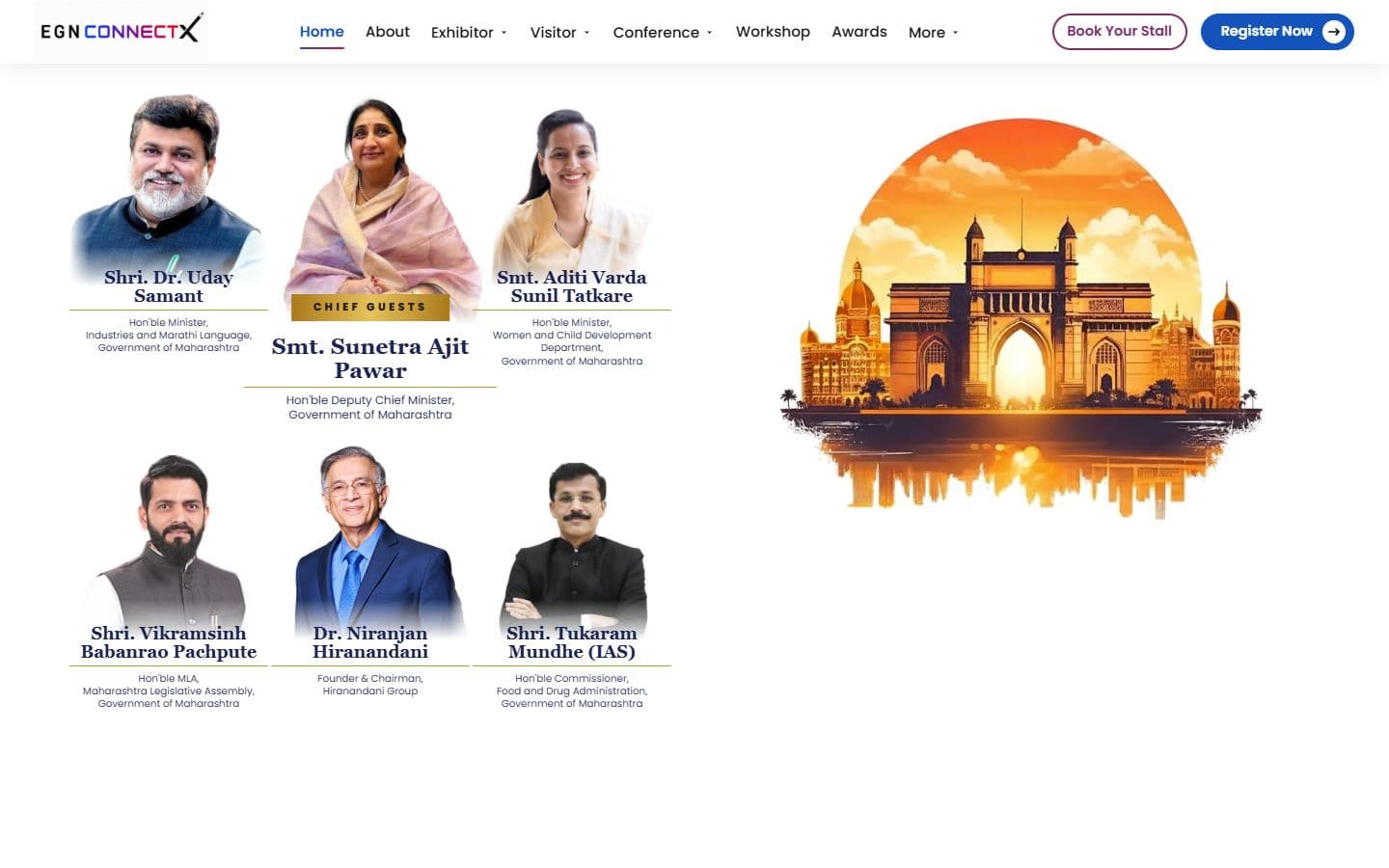
The official website for India's big education leadership summit. People can register, book stalls and nominate for awards, and explore the venue in an interactive 3D floor plan. Over 20,000 visitors are expected.
An online store for classroom equipment, built without a framework: 34 products, filters, a cart, checkout and a demo account.